
Designing an SOS Button.
Role:
Project Coordinator, Lead Visual and UI/UX Designer, UX Researcher
Collaborators:
Sarah Austin, Kamran Jahadi

Background
On April 12 of 2018, after a series of high profile sexual assault lawsuits, Uber announced that it would implement new safety features and improve on its existing ones. True to its word, Uber has been testing and implementing features like an easily accessible safety center, 911 assistance, trusted contacts, a ride check notification system, etc. ever since.
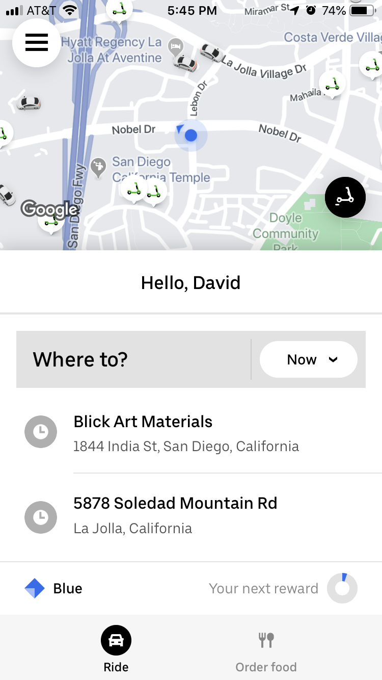
Many months later, in Fall of 2019, our team was tasked with extending or redesigning a feature on the Uber app that helps a specific type of user feel safer in a vehicle. Our target demographic was young adults, partially because in 2017 passengers ages 16-34 made up 65% of Uber’s riders in the United States, and partially for another reason: when this project began, none of us knew that Uber had been regularly releasing new safety features for more than year. In fact, we were surprised that Uber had safety features at all. Sensing a design opportunity, the three of us wanted to investigate how up-to-date our peers were with Uber’s safety features.
Problem Identification
Our team began by interviewing college students around UC San Diego about their previous experiences with rideshare apps and their knowledge of Uber’s safety features. We then had each participant attempt to locate all of Uber’s existing in-app safety features. I co-created interview questions, interviewed a third of the subjects and analyzed research findings, which led to the discovery of major findings and pain points used in crafting our problem statement. Of note:
None
of our participants, before the interview, were aware of any of Uber’s existing in-app safety features.
100%
of participants, after the interview, wished for existing safety features to be expanded upon or better implemented.
66%
of participants reported feeling uncomfortable during a previous Uber ride. The reasons they provided were varied –- physical, emotional, social, etc.
66%
of participants, upon finding all of Uber’s in-app safety features, felt that their locations were unintuitive or difficult to find.
“I stopped using the app because of how unsafe I felt, and I don’t ride alone anymore because of that.” - Soyoun Park, on a previous Uber experience


The Problem Statement
“Young adult Uber passengers often encounter uncomfortable or dangerous rideshare situations they may be
unprepared to deal with because they are unaware of the safety tools they need.”
Making A Plan
The next step was to research and ideate on potential solutions. For this step and for the remaining steps I served as the project coordinator: I delegated roles to the team, set deadlines, and checked in with each team member to make sure plans were proceeding smoothly. Kamran built user personas based on our research findings while Sarah and I researched safety apps and other rideshare apps in order to come up with solutions.
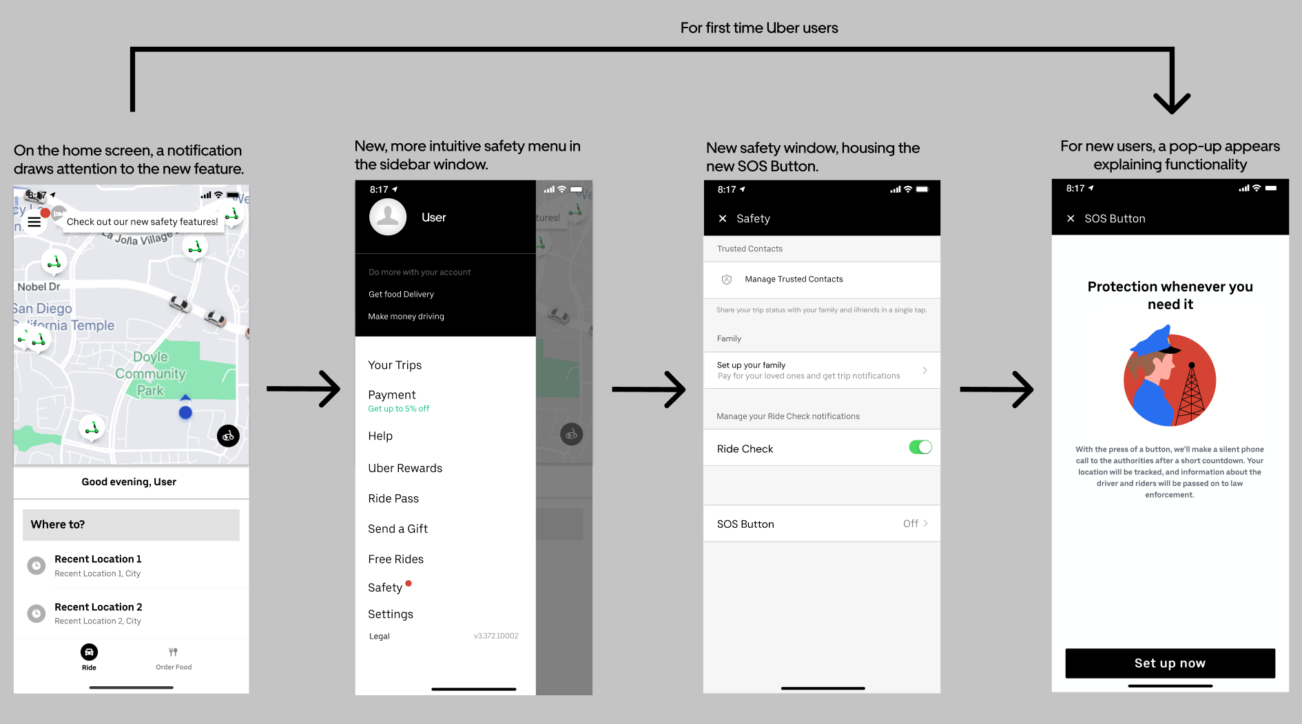
Based on these findings, our team came up with the idea of an SOS Button. I created a UX flow and accompanying UI sketches, with the basic idea being that our SOS Button would allow users to silently dial 911 during a ride if they were in danger. I also included an remapping of existing features within my UI sketches, placing all of them into a new “Safety” tab in order to increase visibility and make accessing them more intuitive.


Paper Prototyping
Based on my UX flows and UI sketches, Sarah created high-fidelity paper protypes of all our UX Flows. The three of us then each ran user tests on these prototypes, and afterwards Kam and I analyzed our findings. All of our users felt that the new Safety menu was a far more intuitive and useful than its predecessor, and that the SOS Button, while not perfectly implemented, gave users far greater peace of mind than existing features. Taking these findings into account, I made come revisions to my SOS Button designed before moving on to the next step.
Digital Prototyping
I really had my work cut out for me in this step. While we were only developing one feature now, our user tests proved to me that my designs were far from perfect. The most common complaints were that the system was cumbersome and poorly explained, the visuals could sometimes be confusing, and that our lock screen functionality was simply not implementable. Based on this feedback, I:
Redid my UX flow, simplifying it while providing more explanation to the user.
Revised the visuals, sketching all the necessary details on paper and making them look closer to Uber’s existing features.
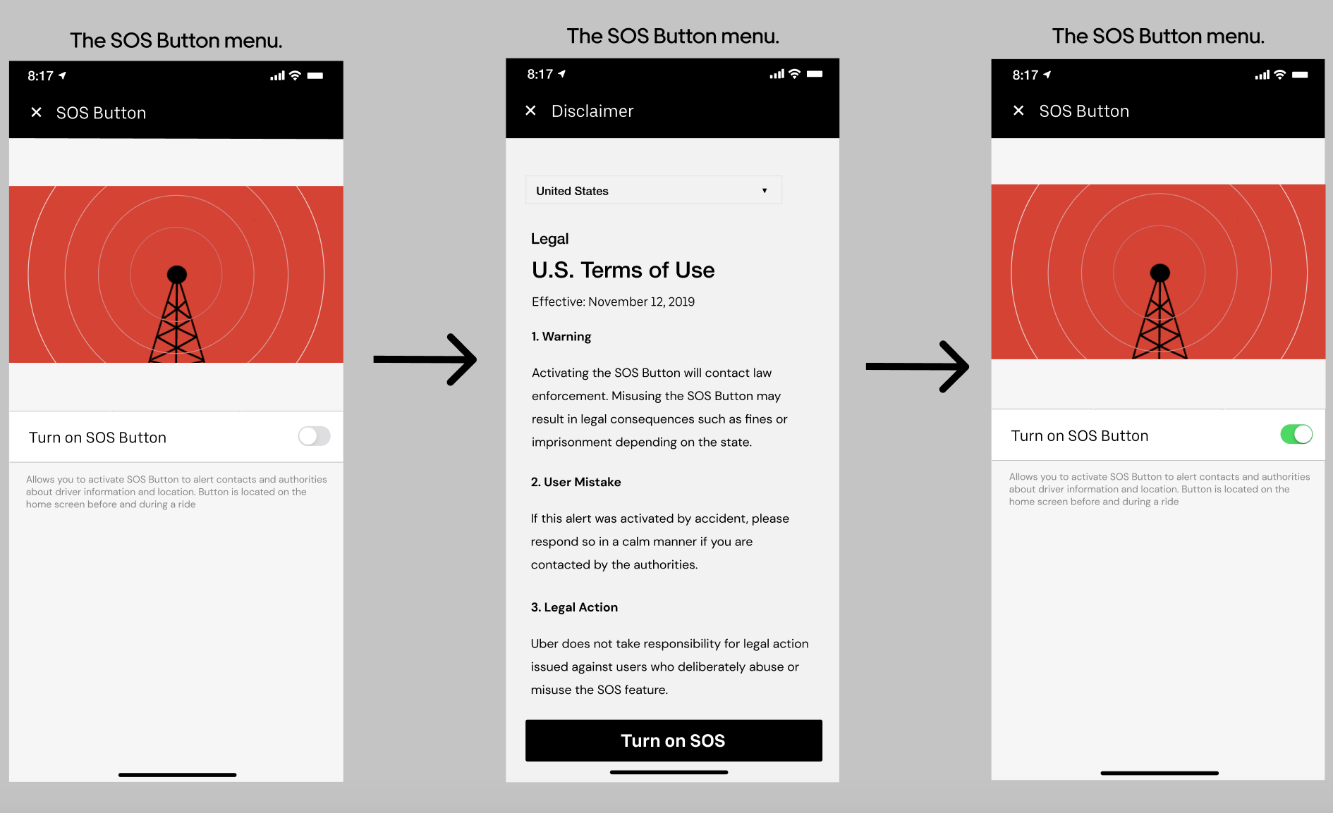
Created custom graphics in Adobe Illustrator for the SOS menu, information screen and activation screen, basing them on existing Uber visual material and color choices.
Designed two new features to be tested – one that in an emergency, allowed the user to bypass the SOS Button’s inherent 15 second countdown, and another that would provide pseudo lock screen functionality by automatically sending the user alerts when the car was no longer following navigation.
Sarah and I then co-created high fidelity digital prototypes in Figma, while Kam headed the analysis section.


Finalizing the Design
After creating our high fidelity prototypes, it was time to run user tests and determine our next steps. I performed all the user tests in this step, and the feedback I received led me to make some significant changes. Notably, I:
Implemented both our alternate features.
Designed banners and red bubbles to indicate to users that a new safety feature had been added.
Created additional entry points to our UX flow.
Added a legal disclaimer.
Designed a post-SOS activation screen that let users know the SOS button was working in the background.
I sketched all of these out on paper first and then recreated them digitally on Figma with Sarah’s help.

Conclusion
Normally, our next steps would be to hone our design with further testing and then perhaps pitch it to Uber, but ironically Uber beat us to the punch by implementing an SOS feature right after our project ended. I still think it was meaningful experience though: I learned a lot about what makes a design successful, and I gained some much needed hands-on design experience.
I want to thank my partners Sarah Austin and Kamran Jahadi, as well as our professor, TA’s and all our interviewees.