This is who we used to be.
When I ran for Public Relations Officer, I was very dissatisfied with how The Beat presented itself. Simply put, our brand lacked consistency and failed to represent our group’s personality. More importantly, it was very indistinct from the seven other a cappella groups at UC San Diego. Many of my colleagues felt the same way, yet it felt like nobody in the group had ever talked about brand or style before. In fact, it seemed like none of the eight a cappella groups had. Instead of following the status quo, I saw an opportunity and took matters into my own hands.
I began by asking my fellow group members what The Beat meant to them, and then by asking how our group stood out from the others. Finally, I asked them to pitch the group to me in 3 sentences as if I were an incoming freshman. Based on their responses, I was able to begin the process of rebranding.
Bold. Striking. Stylish.
When I created the first prototype of our new logo, that was my vision. Out of all the a cappella groups on campus The Beat is the “loudest”: highly social and outgoing, we often horse around during rehearsals and never take things too seriously. Our arrangements are the most difficult out of all the groups, but also the most musically creative.
I chose yellow to represent our group’s energetic and dynamic spirit. The strong and highly-contrasting blacks and whites communicate a spirit of boldness and daring. The hex design was meant to challenge design conventions and stand out from other groups. Finally, for people who aren’t familiar with us, the note symbol signifies that The Beat is a musical group.
I kept the overall design minimal to make the logo easy to remember and recognize.
Time to iterate.
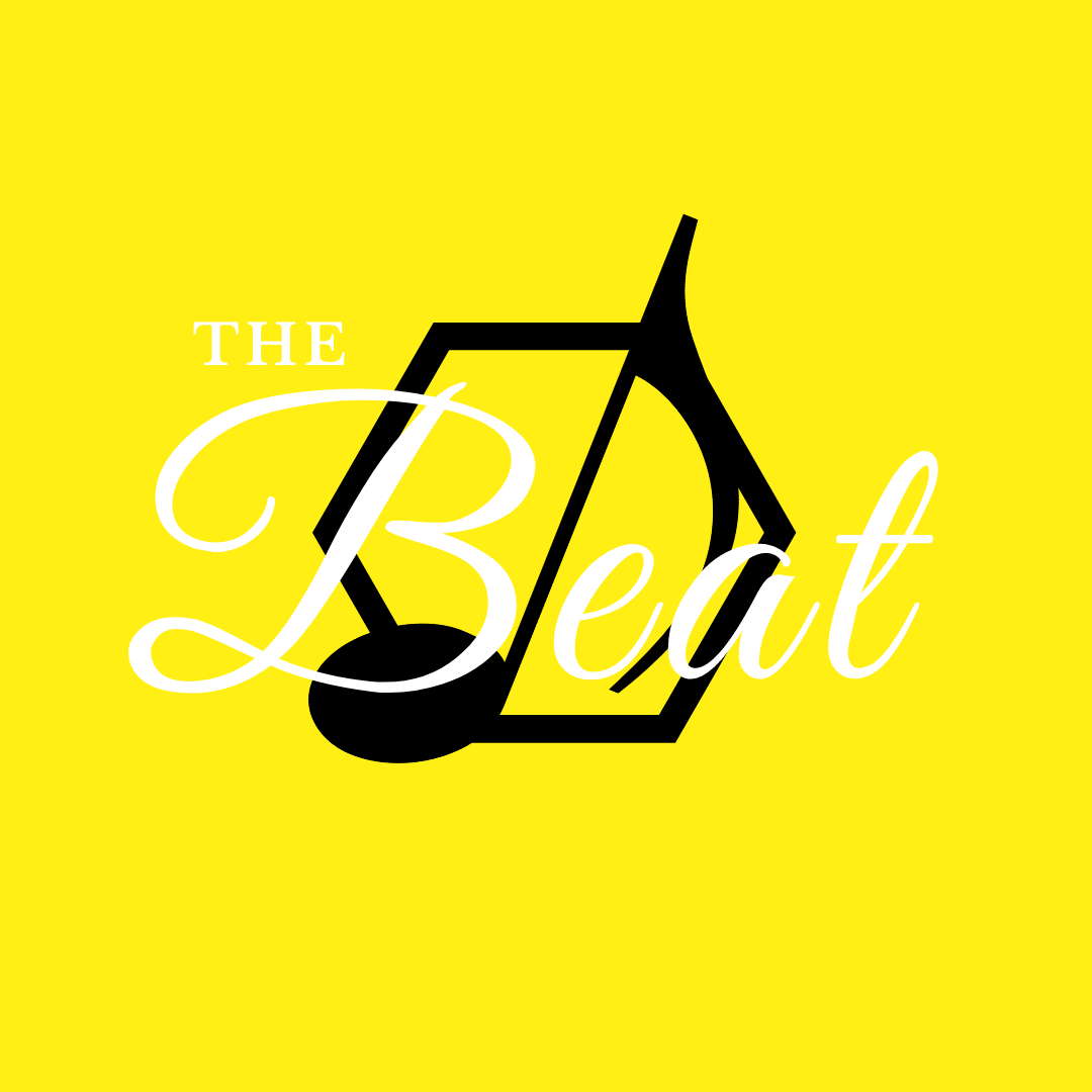



I got a lot of valuable feedback when I showed my group members the first prototype. While they really liked the use of yellow, we all agreed that I needed to change the shade to something less garish. The hex needed to contrast more with the note or else it would look awkward, and the text was simply too distracting. Finally, we all concluded that the prototype was a bit too safe — it wasn’t quite bold enough to represent our group’s personality.
Taking all that feedback into account, I began iterating on my design. With every iteration, I experimented with the colors and shapes and got feedback. In the end I decided on an asymmetrical, unconventional double hex design because it looked even more distinct from other logos. It was just daring and rebellious enough to fit our group while still being minimal and easy on the eyes.
After the new logo design was finalized and approved, I began creating promotional content and style guidelines, making sure to stay true to our group’s spirit.
This is who we are now.

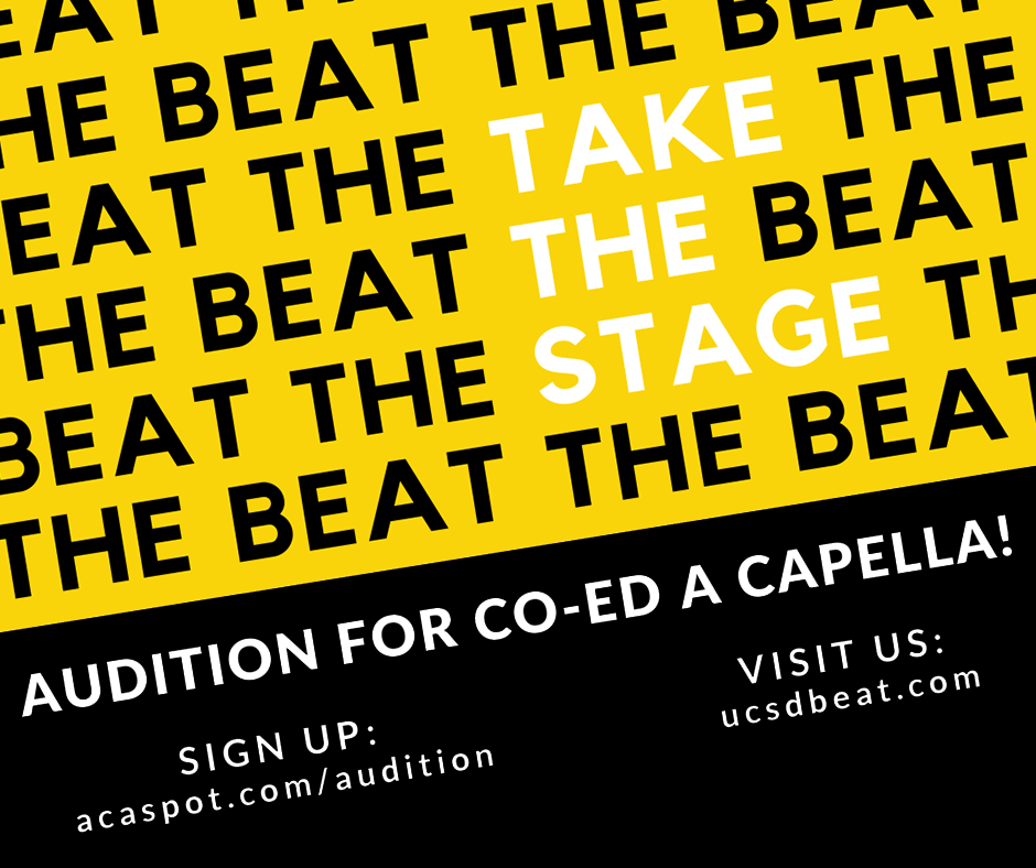
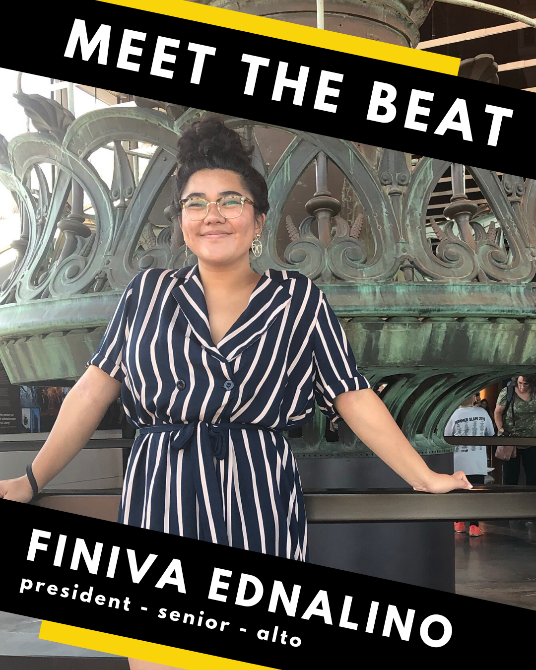
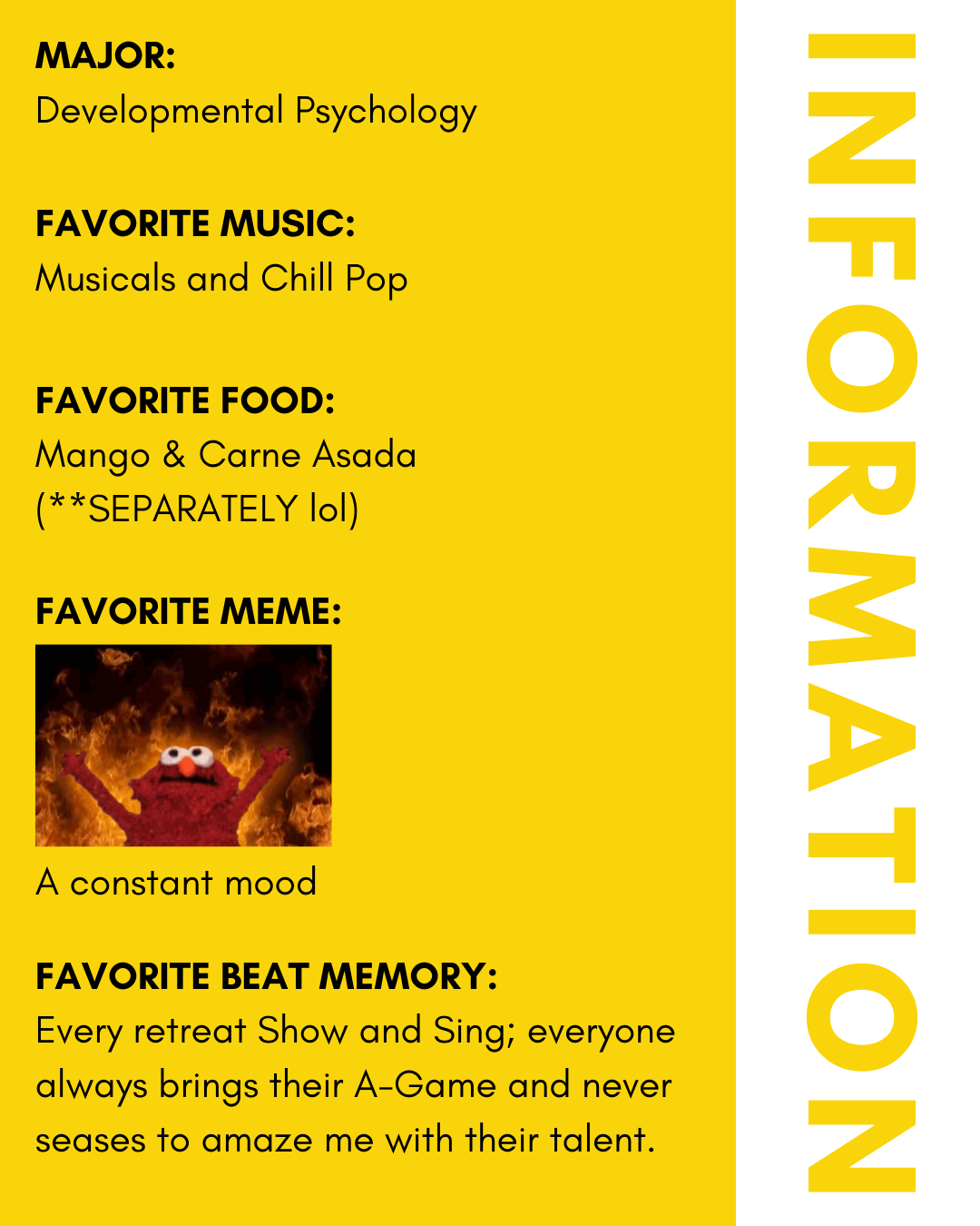
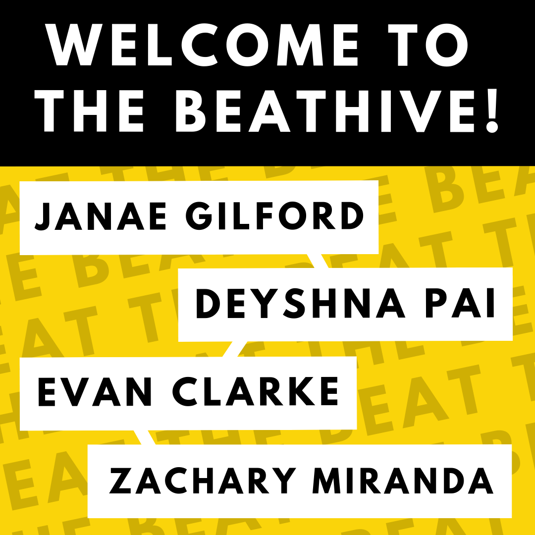
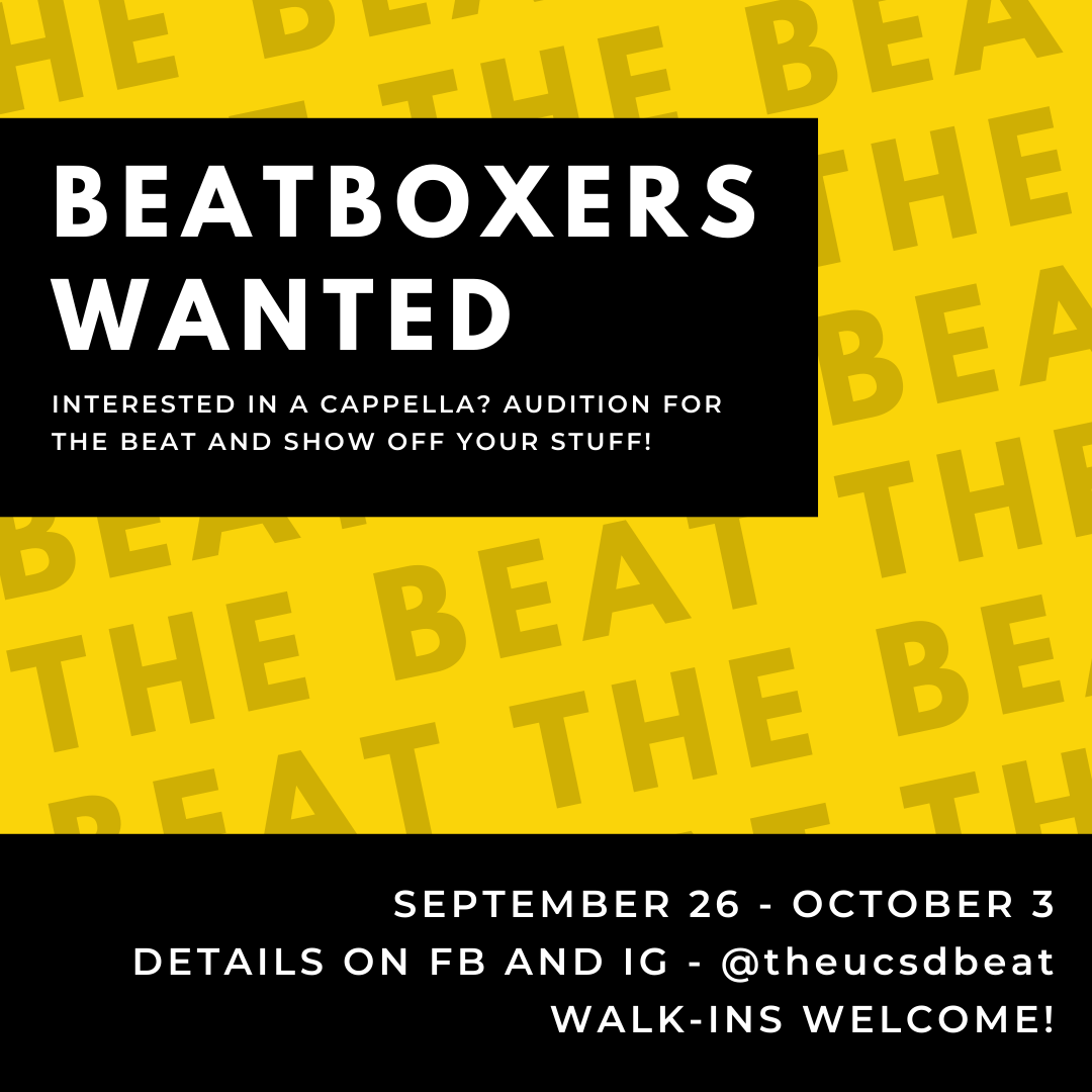
My goal was to differentiate The Beat from other a cappella groups by creating a strong brand. A strong brand doesn’t just represent you, it is you. Your personality is carved into every font choice, color palette and aesthetic detail. Having a strong brand means that when you walk on stage you never have to introduce yourself. It means that you never have to tell an auditionee whether your group is casual or competitive or fun-loving, because your personality is self-evident.
In short, a strong brand is part of what separates the ordinary from the extraordinary.
So far, my rebranding project has created a lot of excitement both inside and outside of our group. It’s given our group members a sense of pride and unity, and some of the other groups have even told us that they wanted to step up their own branding in response. When it comes to our brand though, I’m only just getting started. I learn something new with each design I make, and I can’t wait to see how far it will take us.


